|
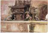
The Tour In 2003 an exhibit titled Sargent and Italy has been moving its way eastward across the United States. First in Los Angeles and currently in Denver, the exhibit showcases approximately 90 paintings by John Singer Sargent. The show in Denver runs from June 28 September 21, 2003. On July 11 I viewed the exhibit at the Denver Art Museum. Venue The Denver Art Museum is located
at approximately 12th Avenue and Broadway Street in the southwest part
of Denver. One Denverite described to me the outside of the museum as a
castle that was never completed. But do not judge an art museum by its
cover (of cement). The inside of the museum is a charming, well-spaced
structure with a staff that could not have been more helpful. The Sargent
exhibit is located on the first floor of the museum. It takes up about
five rooms and, by my count, consists of 58 oils and 25 watercolors.
And if you do visit the museum, be sure to check out the Singing Sinks
in the washrooms; washing your hands will never be the same.
The opening act consists of an 8-minute video on the life of Sargent and his progression from painting oil portraits (I shall never again!) to painting watercolors. I recommend seeing the video, even if you are well versed in Sargent and his life. Headliner As a kid I was fascinated by the
drums. Every song I listened to, I listened for the drums. What was the
drummer doing? What kind of drum kit was he using? Who were his influences?
I unfortunately have retained that myopia, both with songs and with paintings.
I am a watercolorist: on some days an okay watercolorist and on other days,
I pretend to understand the medium of watercolor. And because of
that myopia and interest in watercolors I am presenting the watercolor
part of this exhibit.
The following is a list of the watercolors in the order they appear in the exhibit. The dates have been supplied by the Denver Art Museum. I have added my observations to some of the paintings, but like with most great work, the genuine article must be seen to be appreciated. A hats off to the museum for not roping off any of the watercolors, thereby allowing the viewer to get as close to the painting as he or she desires.
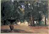
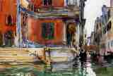
(1) Mountain Fire (circa 1903). One of the early tenets that a watercolor student learns is that cool colors recede and warm colors advance. Sargent often did not play by the watercolor rules, including that rule. The mountains in the background of this painting appear to be burnt sienna while the foreground is a combination of blue and green. This painting has a very strong Japanese/Chinese feel to it, with the foreground having been painted mostly wet in wet.
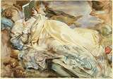
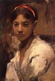
(2) Woman Reclining (circa 1911).
(5) In the Tyrol (1904). The center of this painting is a small waterfall or rapids that was painted with ultramarine blue and appears to have been done without the use of any type of masking product or white paint. The background is one that Sargent used a lot in his watercolors: a mass of varied brushstrokes that, when viewed closely, appear to be a random process, but when viewed from afar, dovetail perfectly.
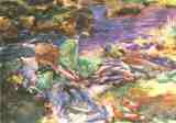
(6) Purtava Alpine Scene with Boulders (circa 1904-1908). This painting appears to have been painted with just three colors: french ultramarine blue, raw sienna and burnt sienna. I have always been impressed with Sargents watercolors of mountains, and especially his series on rock quarries. This painting is similar in construction to Sargents painting of a downed World War I plane (I cannot recall the title).
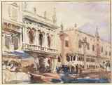
(11) Loggia Florence: Sir William Blake (1910). This is a painting of Blake painting while sitting in a chair on a patio in the left 1/3 of the work. The hinting at the tools used by the artist Blake are reminiscent of Sargents Venice canal paintings in that the technique is a subtle one, leaving the viewer to piece things together and thereby avoiding a full-blown assault. The patio area in this painting and the strong vertical posts and columns on the right side of the painting provide a nice balance.
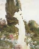
(14) Boboli Garden (circa 1907). This painting consists of three clumps of trees and a road. The trees are painted in quite a variety of color. I was unable to determine if the trees were painted wet in wet. The large masses of the trees coupled with the small road that leads to the back of painting provide a nice contrast in shapes. It appears that Sargent added white paint rather than leaving the white of the paper.
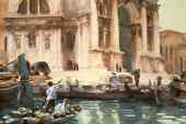
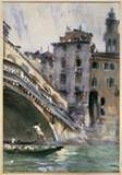
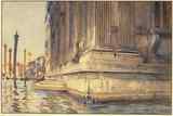
(15) Santa Maria Della Salute (sometime after 1900). Strong horizontal lines depicting the steps make this one of the most oblong paintings at the exhibit. The placard next to the painting informs that Sargent used a pencil, rather than paint, in bringing out the steps. This is one of the few paintings in the exhibit where Sargent painted the entire building, instead of his usual view of a portion of a building.
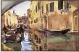
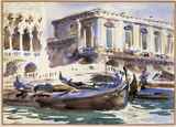
(17) Campo dei Gesuiti (circa 1902). Encore The remaining watercolors are of the canals in Venice. Since most of Sargents watercolors that I have seen in books are of the canals, I have not provided any commentary
Afterthoughts This exhibit, to me, defines what
it means to paint watercolors. No book could have prepared me for the beauty
of these paintings. Like a building design, the paintings contain no unnecessary
brushstrokes. The paintings have such freshness, are painted with seeming
abandon, and are so deceptively simple in technique, composition and color,
one is tempted to think anybody could do that. But, like watching Buddy
Rich play a triplet fill on his drum kit, I know better than to think that.
© 2003, Jim Niendorff a Friend
of the JSS Gallery
I couldn't laud the Denver Art Museum more for such a beautiful exhibition -- from the way it was organized, presented, to the friendly way in which they greeted us. I couldnt have felt more at home, more welcome, I'm even hard pressed to imagine how I could have enjoyed myself more or how anyone -- anywhere could have presented this better. Not to disparage LA as I'm sure the enthusiasm of the moment probably had a lot to do with it, but the feeling apparently was felt by others. In one of the rooms I talked with a visiting art student who had seen the show in LA and she offered, without asking, that between the two, the presentation by Denver was the better by far Denver had done it -- that good! The show was divided into seven rooms, Jim being a watercolorist probably isnt counting the introduction area and the room where they had the drawing postcards (Ill talk about that a little later). In fact, room division is a little undefined there towards the last so it depends on how you interpret it. The rooms were arranged roughly as follows: 1. Introduction 2. Early Italy Capri Trip and the Venetian Studies 3.The Italian Alps in Oils and Watercolors 4. More Italian Alps 5.The Portraits 6. Florence and the gardens -- make your own postcards 7. Sargent in Venice, Watercolors and Oils Once you have your ticket you can enter any time. There is no audio accompaniment so people move along essentially at their own pace. Entering the first room, I found it dimly lit for the introduction film on Sargent was set off to the side along with preamble plaques. I immediately recognized the narrative voice of Jacqueline Bisset from a film documentary produced for PBS (Public Broadcasting System) in 2000. I assumed the longer documentary had been edited to 15 minutes, and since I had already seen it, I personally skipped it too much like a child at Christmas, I suppose, ripping the presents open without noticing the wrapping paper; but I would agree with Jim that its highly worthwhile if you havent seen it. The only painting in this introductory room is the only oversized portrait in the show the rarely publicly seen (until recently) -- the eye-catching the beautiful Mrs. Ralph Curtis (nee Lisa de Wolfe Colt) whom Sargent painted in 1898.  That she should be the one that opens and welcomes the visitors is fitting, as it would be the Curtises whom Sargent had spent so much time with when he was in Venice. As I left her, the first full-room of paintings brought me back to Sargents early sojourns to the country when he was still studying, to some extent, with Carolus-Duran or just after. The room was filled with his oil studies, none of which I had never seen before. There were his painting of 1880-1882 along with his earlier trip to Capri in 1878. The first wall was dedicated to Capri and the Rosina paintings. Im going to write more when I have time, but I wanted to quickly get my overall impression of things. Jim has given a nice overview of Sargents watercolors. The thing about Sargent, and something that this show only reinforced for me, is the visceral nature of his art it just cant capture in photographs or images you just have to see them yourself! After I walked through and looked at all the paintings like everyone else 2 or 3 feet away and made notes about special ones I wanted to comment on publicly or just notes for my private self, I went back and sat down in the chairs or stools provided in the middle of many of the rooms and I looked at these paintings again from some distance away. Its important to remember the kind of rooms Sargent had intended these to be seen in, the distance that he envisioned -- the Manor homes, the large lofts, the large country estates. Not so much the opulence of his intended clientele, but the dynamics of the rooms in how much space people would have to see these from. You see, given the proper distance, some of these painting just come to life! Now thats an overused phrase thats come to mean very little; but these paintings seem to literally come off the canvas three dimensional! The otherwise blurred or busy energy of his bravura style just crystallizes into remarkably sharp and defined images. Its fun to see up close the marvel of this Master as you can literally see every brushstroke, but dont forget to step back and see the paintings the way he intended them to be seen. When Sargent painted, he NEVER sat stoic in front of a canvas. He was always moving back way back, checking his subject against his painted surface -- from where he intended you to see it -- then rushing forward with paintbrush to add more. There are really two shows going on here. Up close a persons gets to peek behind the magicians curtain but dont forget to appreciate the affect of his genius from the center of the each of these rooms.
From: "genway gao" <genway@genway.com>
Date: Fri, 10
Oct 2003
Natasha,
I went to see the LACM's Sargent show of course! This time was with my wife and my 7 years old son, we had wonderful time in LA, visited Disney and Universal Studio too. Anyway I want
you know just few things I noticed at the show. A painting on the wall
(Not again!!!) is reversed from
what it should be in the catalog on page 74, "A street in Venice",
and that is it. Although two other paintings are very suspicious
to me, I have not located who I think is the original painter, and no hard
evidences yet about this so I will hold until I find the facts. But
many things indicated a "fishy" smell from those two paintings.
On pages 34 and
137, both paintings about Cypress trees in San Vigilio [n/a]. The actual
paintings at the exhibition are of a very large canvas format and I have
not seem any works by Sargent using large brushes without the aid of finer
detail work. And as far as I know, almost every primary study and
sketch that I've seen, no artist would ever use such a large and odd size
canvas. The format and size is for exhibition and final works, but the
style is of a sketch, it is more likely done by one of his contemporary
fellow artists and not Sargent.
I don't have solid evidence yet, but just wanted you know what my feeling were. By the way, in Italy, San Vigilio is not a specific place, rather a few places have similar name, so it is confusing. I still have not really done any painting myself, but will have the chance to paint in Switzerland by next month and maybe in Italy, I will let you know when done. Take care and
wish you have great day!
Genway Gao From: Natasha That is so strange that you should mention about the paintings of Cypress trees in San Vigilio. My gut feeling when I saw these paintings as they were on either side of "San Vigilio, Lake Garda" was that they struck me as . . . . well . . . . being something wrong about them. But I got to tell you, I was with another artist friend when I was seeing the show and my friend went on and on about these paintings for the very reason that no finer detail brush was ever used and other people in the room were saying the same things, about how wonderful these were, the Denver show, along with the catalogue, as you know, made such a big deal about these paintings. I just repressed my thoughts that they didn't look quite right to me either!!!!! certainly there is nothing really that comes close to it (in size like you say) that I have seen or that is online at the JSS Gallery. Obviously, there is a lot about his work I don't know and I find it odd that there are such few other examples in Sargent's work. It would be interesting to know WHEN these paintings entered Sargent's known oeuvre.
From
"Simone Simonian" <simonsimonian@comcast.net>
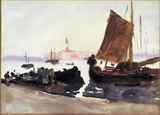
Date: Sat, 25 Oct 2003 . . . Did you get to Los Angeles this summer to see the show at the L.A county? I did not think that show was all that great, Los Angeles doesn't know how to show a Sargent show, it was very lack luster in my opinion, however the boats at San Vigillio(sp?) were outstanding and you need a better picture of them on your site, the colors of the sails and the water were unbelievable and breath taking. Notes
Genway is one
of my resident skeptics who saw problems with the Madame
Ramon Subercaseaux painting as well as the Mrs
Charles Russell painting at the Retrospective
Exhibiton back in 1999.
Whether you agree with him or not you HAVE to give him credit for being a VERY astute observer.
|


|
|
|||
 |
 |
 |
 |